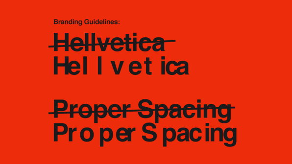
Creative people can be so fun! Take this…a couple of designers created a new typeface based on the popular Helvetica typeface. Except this will make designers scream. 😱
It’s aptly named Hellvetica. The designers cleverly changed just enough spacing between the letters to make even the easygoing communicators go insane.
Even the branding guidelines are a nightmare. The “testimonials” on the hellveticafont.com website are funny, including one from Satan. And of course, it was released around Halloween, which makes it all too perfect.
How do people come up with this stuff? I guess that’s why we call them “creatives.”
Helvetica is one of the most popular typefaces. Born in 1957, it’s used on the New York Subway system and is the brand typeface of Target, Microsoft, Toyota, Nestle and too many others to name.
Earlier this year, Helvetica got a facelift. True marketing nerds can read about that here.
